About the Organization
Philly Cooks for Philly (PC4P) (PCFP), a recently established nonprofit partnership, plans to construct a local facility and infrastructure dedicated to producing meals within the city of Philadelphia. These nourishing meals will be distributed to schools, hospitals, and various government organizations. Creative Repute was contracted to develop a brand identity for Philly Cooks for Philly.
Mission:
To promote sustainable and equitable access to nourishing meals in Philadelphia, driving economic growth and job opportunities. Through strategic partnerships and responsible sourcing practices, PC4P fosters a thriving food ecosystem, emphasizing local production and waste management for a resilient and inclusive community.
Vision:
Philly Cooks for Philly envisions a dynamic public-private partnership that fosters economic development and empowers individuals in the workforce. “We believe in the power of combining nourishing meals with opportunities for personal and professional growth to create a vibrant and thriving community.”
About the Project
Creative Repute conducted a comprehensive discovery process and developed a complete set of branding identity materials to prepare Philly Cooks for Philly for a successful launch. These services encompassed: (1) Market Research, SWOT Analysis, User Persona Development, Moodboard Development, and a Creative Brief, (2) a Style Guide, and (3) the Logo Design.
Our Approach
Philly Cooks for Philly sought a brand identity that would be visually appealing, instantly recognizable, and deeply rooted in Philadelphia’s rich culture. This required having Creative Repute team members who were intimately familiar with and passionate about the city. After thorough research and finalizing the Creative Brief, our team presented PCFP with multiple design options within the Style Guide format, allowing the client to explore various design directions for their new brand.
Creative Repute created three distinctly different design options, each representing a unique direction with mood images, typography, and color palette options. These were each inspired by an in alignment with PCFP’s mission and our discovery research . One design direction was inspired by the color scheme of the Philadelphia School District, which spoke to PCFP’s main clientele. Another samples elements from the vibrant neighborhoods of Philly. The third was a fusion of the first two, reflecting the clientele and mission of providing local food to Philadelphia.
After meetings and feedback rounds, we decided to proceed with the neighborhood-inspired direction while exploring another option that was even more “fun” to appeal to a younger student demographic benefiting from Philly Cooks for Philly’s efforts. Once we had the overall direction narrowed down for the style guide, several graphic designers from the Creative Repute bench of specialists submitted logo concepts based on the client’s notes and feedback from our meetings so that the client has a wide range of options to choose from.
Brand Identity Project Challenges
Throughout the brand identity project, we grappled with the challenge of balancing the need for a unique identity with the desire to avoid typical food-related design choices while maintaining a core identity as a Philly organization.
PCFP initially desired a clean and professional aesthetic, but also aimed to appeal to a younger audience, particularly schools and students. Balancing a fun visual aspect with professionalism to attract investors was a challenge that Creative Repute eagerly meet. While PCFP is a food-centered nonprofit, they wanted their branding to encompass more than just food. This required breaking away from traditional food-related design elements.
Outcome
Creative Repute’s collaboration with Philly Cooks for Philly resulted in a brand identity that authentically embodies the organization’s values and mission while resonating with the spirit of Philadelphia. The Creative Repute team successfully created branding materials that aligned with PCFP’s desire to be playful but professional. Some of the new PC4P color names were “Gritty Orange” and “South St Indigo”. They were paired with traditional white and black backgrounds to maintained a professional, clean look combined with clear sans-serif fonts.
The Philly Cooks for Philly logo captures the essence of the organization, a harmonious blend of community, culinary expertise, centralized operation, and a commitment to delivering high-quality food services prepared by and for Philly. Philly Cooks for Philly’s logo is a visually striking representation of the organization’s mission and values containing the following elements:
- Letter P with Fork: At the heart of the logo is a prominent letter ‘P,’ which symbolizes the city of Philadelphia. It cleverly integrates a fork, representing culinary excellence and the importance of food in Philly’s identity.
- Circular Plate: Encompassing the ‘P’ is a circular shape that gracefully forms a plate. This plate signifies the central role of food preparation and service in the organization’s mission.
- Typography Fusion: The typography of “Philly Cooks” is creatively integrated into the design. The “Y” and “C” come together, almost as if they’re in a culinary embrace, with a slanted cut through them resembling a knife’s precision.
This fulfills the client’s wish for a logo that subtly alludes to food instead of being overly literal, making it suitable for various marketing materials such as stickers and clothing to promote the nonprofit.
Our comprehensive research and strategic approach paved the way for a successful launch and the development of essential marketing materials, including:
- Creative Brief
- SWOT analysis
- User Personas
- Comprehensive Style Guide
- Logo
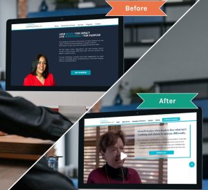
- Revamped Website
- Newsletter/Announcement Template
We’ve already received one newsletter with the new branding and eagerly anticipate many more as we witness Philly Cooks for Philly making a profound impact on our community.