At Creative Repute, design is more than visuals. It is the bridge between your mission and your audience upon first impression. That’s why color is one of the first and most important choices when building or refreshing a brand style guide color palette.
Like our previous work with William Way Community Center’s capital campaign, 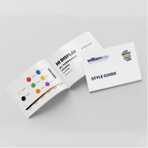 we consider how strategic color choices can bring focused attention to a campaign. While the Center’s overall identity had been established since 1976, this project in particular called for a distinct design approach to highlight a multi-year fundraising effort and repair its 200-year-old building and strengthen its community base. Rather than reinventing the brand, we created a campaign-specific visual identity that complemented their legacy while amplifying the urgency of their cause.
Color is more than just aesthetics; it shapes how people feel about your organization. A well-chosen color palette establishes recognition, fosters trust, and communicates core values effectively. At our agency, we specialize in aligning brand colors with mission, industry, and audience psychology to make your visual identity feel stunning and authentic. For the William Way Community Center, we identified user personas to further understand the key audience, which resulted in a style guide of suggested typography, color palette, and custom collage files. We took inspiration from the LGBT+ flag by toning down the rainbow colors and combining them with shades of skin tones to represent inclusivity. The approach ensures the client’s campaign will appeal to a wider audience and offers a familiar recognition for community members of all backgrounds to feel at home at the center. Learn more about our process with the William Way Community Center’s capital campaign and its results in this case study.
Why Color Matters in Branding
Think of iconic brands: Tiffany blue boxes, Coca-Cola red, or the unmistakable golden arches of McDonald’s. The colors transcend logos and typography, becoming shorthand for the entire brand experience.
Color is a powerful tool that can:
-
-
- Establish instant recognition. Consistent color use allows audiences to identify your brand even without words.
- Evoke emotion. Warm colors like red and orange energize, while cool blues and greens calm.
- Convey values. Bold colors can signal innovation, while earthy tones can highlight sustainability and trustworthiness.
- Unify experiences. Your chosen color palette connects every touchpoint, from websites to event booths.
-
Our Approach to Choosing Your Brand Colors for Your Style Guide
Color selection is not random but a strategic, collaborative process for their brand style guide color palette. Here’s how we guide clients through it:
1. Start With Authenticity
We begin by asking core questions:
-
-
- What does authenticity mean to you?
- What is your mission?
- What defines your industry?
- How do you want your audience to feel?
- What does authenticity mean to you?
-
When we can deepen and confirm the brand’s emotional core, the configuration within color pallets creates magic. Color choices should organically emerge from your values, rather than feeling forced.
2. Translate Brand Traits Into Hues
A brand that is bold and disruptive might lean toward sharp, saturated colors, while one that is compassionate may gravitate toward 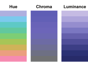 softer pastels. At Creative Repute, we explore your brand’s personality traits and identify not only certain colors but also how they stand in a hue, a tone, or a spectrum of tones, ensuring your palette reflects your unique voice.
Consider the different properties of color: Hue shows how the color appears and its placement on the color wheel. Another property of color is chroma. We consider whether the color is a pure replication of how it appears on the color wheel. In addition, what shade has a value of black added, tint if it has a value of white to it, or tone if it has a value of grey to the color. Lastly, we look into lighting and consider how pale or saturated the color appears.
3. Understand Industry Standards
Industries often gravitate toward certain colors. For example, blue is largely used in tech, green for wellness, and purple for creativity. We analyze these trends to ensure your palette feels relevant, but we also look for opportunities to stand apart.
4. Competitor Analysis 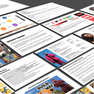
We study competitor brands to identify patterns and gaps. For example, if every company in your space uses shades of blue, we may position you with a complementary or contrasting palette that still feels approachable but unmistakably distinct.
5. Build Familiarity & Connection
Colors trigger memories and cultural associations. Blue often conveys calmness due to its association with the sky and water, while yellow suggests energy and optimism. Furthermore, we assess how our clients may be involved internally or globally. That’s why our team considers both universal meanings and current cultural trends. The color white represents purity, innocence, and new beginnings, whereas Eastern and Asian cultures symbolize white as death, mourning, or funerals. Through the thoughtful engagement and research we share with our clients, we can help tap into these associations strategically to reinforce what the brand represents while cultivating trust.
The Role of Color Theory That Helps with the Pallette
Color choices aren’t only emotional, but they’re also rooted in science. We follow Interaction Design Foundation’s insight along the lines of
“Color theory is the collection of rules and guidelines which designers use to communicate with users…and refer to extensive collected knowledge about human optical ability, psychology, culture, and more.”
At Creative Repute, we ensure your palette is both visually balanced and emotionally resonant as we lean into tools like the color wheel, harmony rules, and contrast guidelines. These are aspects for a successful brand style guide color palette.
One tool that we enjoy using is the Adobe Color Wheel, as it helps choose color schemes and generally explores the different combinations of styles. Explore and experiment with this color wheel to review compliment colors, contrasting colors, monotones, and more.
Similar to our work with the William Way Community Center, we evaluated how we can bring forward other organizations’ presences. For example, we chose a palette that blends rustic greens with a bold, radiant orange for the Gender Justice Fund. This combination conveys balance: groundedness and growth alongside urgency and action. Read to learn more about how we reinforce the Gender Justice Fund’s mission of equity and justice while also standing out from traditional nonprofits’ usual colors of blues and grays. Lastly, in an effort with Land Based Jawns, we crafted a brand identity using rich, grounded tones and warm coral hues to honor the organization’s connection to land, heritage, and empowerment. These colors for Land Based Jawns resonate with authenticity while building strong visual recognition.
Color Accessibility Considered in Brand Style Guide
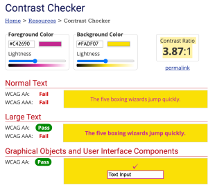 With all of our clients at Creative Repute, we emphasize that accessibility in design is just as important as aesthetics. When we help clients choose brand colors, we make the results visually striking and ensure they are inclusive. Using tools like contrast checkers, we test color combinations to confirm they meet accessibility standards, including readability for people with color blindness. This step ensures that your brand communicates clearly and equitably to all audiences, so no one is left out of the experience.
Accessibility also involves thinking carefully about complementary colors. Certain color pairings can be beautiful in theory but challenging in practice, especially when text overlays or digital interfaces are involved. To avoid this, we use tools like the Adobe Color Wheel to explore complementary, analogous, and triadic schemes to bring an user-friendly environment across different platforms with your brand style guide color palette.
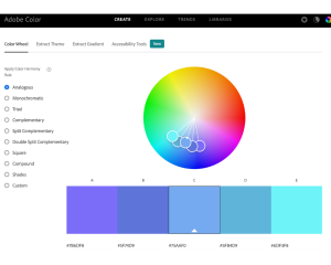 Finally, we maintain precision in execution by working with HEX codes. By documenting exact digital color values, we ensure that everyone, from designers to developers to printers, can work with the same consistent brand palette. This level of detail helps protect brand integrity and guarantees that your chosen colors appear reliable for your campaign.
Why Work With Creative Repute?
Plenty of agencies can make your brand “look good.” At Creative Repute, we design with the deeper intention to ensure your colors will create connection and impact. Through our private consultation, there are three promises that we will keep:
-
-
- We lead with mission and heart. We don’t choose trendy colors. Instead, we select hues that align with your purpose, values, and key audience to ensure your brand feels authentic at every touchpoint.
- We balance research with creativity. Our team honors the science of color theory, competitor research, and cultural psychology, and meets it with intuitive, bold, imaginative design.
- We are excited to dream big with you. From logos and websites to merchandise and full identity systems, we craft color palettes that unify your brand, strengthen recognition, and amplify the impact of your work in the world.
-
With Creative Repute, your story, audiences, and goals are priorities to us, and you will be in nurturing, caring hands for your brand style guide color palette.